4 Effective Web Design and Development Techniques for Seamless Navigation
4 Effective Web Design and Development Techniques for Seamless Navigation
Blog Article
One of the most crucial aspects of creating a user-friendly website is navigation. Smooth, intuitive navigation keeps users engaged and encourages them to explore more of your content. Whether building a new site or revamping an existing one, optimizing the navigation is essential to delivering a positive user experience. Here are four effective web design and development techniques that ensure seamless navigation.
1. Prioritize a Clear and Simple Menu Structure
A cluttered or overly complex menu makes it difficult for users to find what they want. Instead, aim for a streamlined, straightforward menu highlighting your website's key sections.
Top-level menu items should stick to a minimum, ideally between 5 and 7 options. Give each menu item a descriptive label so users know what to expect when they click on it. Additionally, incorporating a well-organized sub-menu structure can help guide users to specific content without overwhelming them. Clear menus ensure users find what they need quickly, enhancing their overall experience.
2. Utilize Sticky Navigation Bars
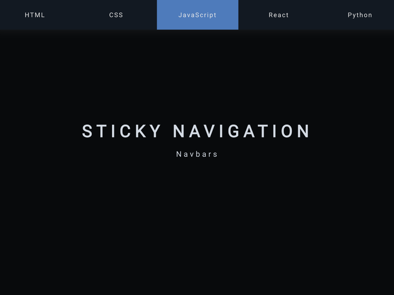
A sticky navigation bar is one of the most practical web design and development techniques for improving user experience. It allows the navigation menu to remain visible as the user scrolls down the page, giving constant access to critical sections. It eliminates the need for users to scroll back up to navigate to another area, making their browsing experience smoother and more efficient.
Sticky navigation bars are handy on content-heavy pages like blogs or e-commerce websites. Keep the sticky bar minimalistic and minimize options, as this can detract from its simplicity and functionality.
3. Implement Breadcrumbs for Better Orientation
Breadcrumbs are a simple but effective navigation tool for showing users their current location. They are beneficial for websites with multiple layers of content, such as e-commerce platforms, online publications, or educational websites.
By displaying a clickable path from the homepage to the current page, breadcrumbs help users quickly backtrack or jump between different site sections. This navigation technique reduces frustration by giving users greater control and making exploring deeper sections of your website more accessible. Breadcrumbs are an excellent addition to enhance the navigational flow, especially on complex websites.
4. Optimize for Mobile Navigation

With more users accessing web pages via mobile devices, optimizing your navigation for mobile is no longer optional—it's a necessity. Web design and development practices must account for smaller screen sizes and touch-based interactions.
Mobile navigation can benefit from a collapsible menu, often called a "hamburger menu," which conserves space without sacrificing access to essential content. Additionally, ensure your buttons, links, and menu items are large enough for users to tap easily without misclicking. A mobile-optimized navigation system improves user experience and positively impacts your search engine rankings, as responsiveness is critical to SEO.
Conclusion
Effective navigation is a critical element of successful web design and development. By prioritizing a simple menu structure, utilizing sticky navigation bars, implementing breadcrumbs, and optimizing for mobile, you can provide a seamless experience that encourages users to explore your site easily. These techniques ensure your website is user-friendly and functional, increasing engagement and overall satisfaction. Whether building a new site or improving an existing one, incorporating these techniques into your web design strategy will enhance how users interact with your content.